Code
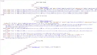
The Fox Cities Performing Arts Center (PAC) website is a WordPress site. When inspecting the page's code, there are folders that begin with WP and there is a section for plugins and the theme files. When viewing the page source, the code is very complex and not the most organized. This was the first website where I have noticed after a class name the letter "d." After researching this, I learned that d means that a path is drawn. Numbers and letters can be used to shape the path which is exactly what we see in the code screenshot.
User Interface - UI
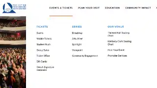
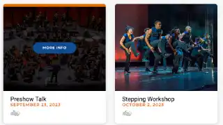
The Fox Cities PAC website has a blue and white color theme. There is generally white text on the blue backgrounds and black text on the white backgrounds to make the site easy to read. However, there are some spots where there is orange text on a white background and this does not pass the ADA contrast check. This would be difficult for some people to read. The website overall has a very modern look and feel with the graphics stretching the full width of the page and a video playing to add some movement at the top of the page.
User Experience - UX
The Fox Cities PAC website has a good load time with about 2 seconds per page. In addition to working well on a desktop, the Fox Cites PAC website also works well on mobile devices. The text is a readable size and the user does not need to zoom in. All of the links clicked worked. In addition, the Fox Cities PAC website has an accessibility widget in the bottom right corner of their pages to assist anyone who might be colorblind or disabled.
Summary
Overall, the Fox Cites PAC website has a nice modern layout and the website is nice to use. The website colors look good together, it's easy to read, the site load time is good, it's mobile friendly, and it even has a widget to assist with accessibility.